Food and Drink: Smoke & Ember BBQ
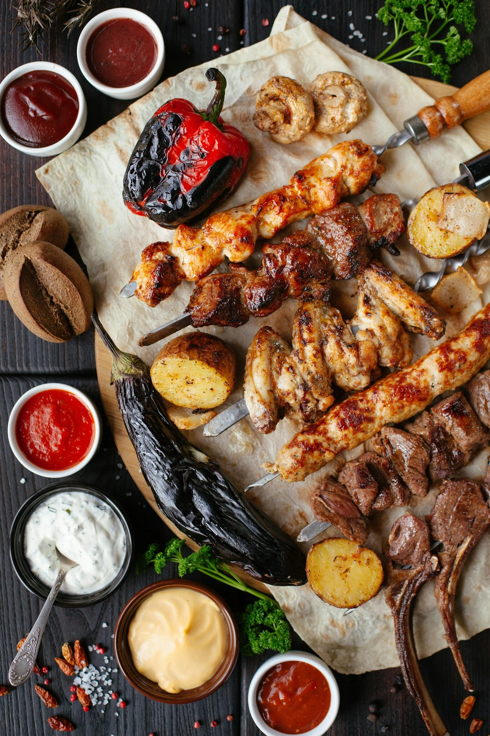
Smoke & Ember is a new, modern barbecue restaurant that’s launching its flagship location in a bustling urban district. Our mission is to bridge the gap between the low-and-slow traditions of Southern America with a more contemporary, elevated dining experience. We want a comprehensive visual identity that honors the rustic, elemental nature of wood, fire, and smoke, while remaining clean, sophisticated, and appealing to modern foodies.
Brand identity
Our core philosophy revolves around craft, patience, and community. We want to steer clear of tired BBQ clichés — no cartoon pigs in chef hats, no neon signs, and no over-the-top "country shack" kitsch.
Brand personality
Authentic & grounded: Rooted in the genuine craft of wood-fired smoking
Elevated yet approachable: Premium quality food without the pretension; a welcoming, lively atmosphere
Gritty yet refined: Finding beauty in the raw elements (charcoal, cast iron, raw wood) but presenting them with minimalist precision
Target audience
Our primary audience consists of urban professionals, families, and culinary enthusiasts aged 25–45. They value food provenance, appreciate artisanal craftsmanship, and seek out memorable dining experiences. They are highly visual consumers who frequently share their dining experiences on social media.
Design deliverables required
The selected designer will deliver a cohesive brand system, including:
Primary logo: A versatile mark that works on everything from signage to a digital app icon
Secondary marks and brand assets: Sub-mark or monogram for smaller applications (napkins, loyalty cards and aprons)
Color palette: A curated system featuring dominant, secondary, and accent colors
Typography system: Font pairings for headers and body copy
Visual direction and style preferences
Color palette
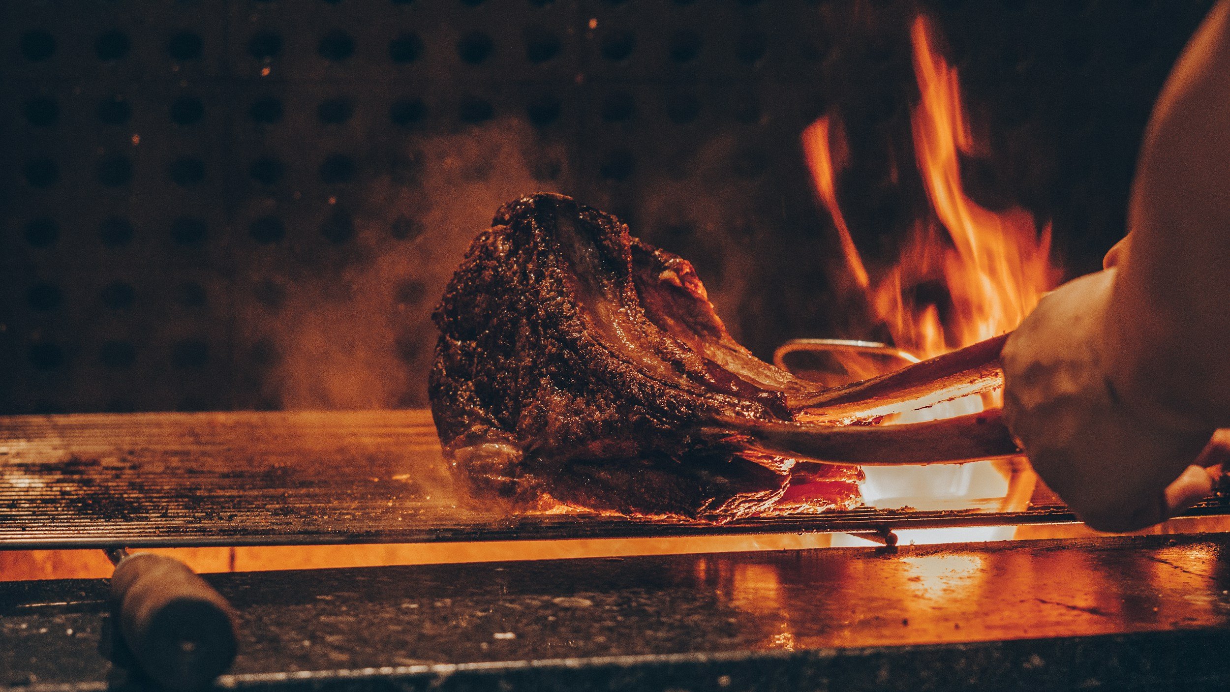
We want a palette inspired by the pit itself. Think deep, tactile tones contrasted with warm, inviting highlights such as carbon black, deep charcoal, and ash grey combined with burnt orange, copper, and warm cream.
Typography
We are looking for a balance of strength and modernism. Think bold, rugged, or subtly weathered sans-serif / slab-serif typefaces and clean, highly legible geometric sans-serifs for when body copy is required.
Project timeline
Concept presentation: 3 weeks from project kick-off
Revisions and refinement: 2 weeks following initial feedback
Final delivery: 6 weeks from kick-off
This timeline is a rough guide based on the projects we have previously completed for clients. We have included it as a guide to illustrate the demands of commercial design but we don’t expect you to religiously follow this.
Success metric
The final brand identity must feel timeless, scalable for locations in future, and instantly recognisable on a crowded street or social media feed.
Submissions
If you would like feedback on your work complete the form below. You can submit a PDF to show your thinking or a short video explaining how you tackled the brief. Our team will review and respond as soon as possible.