Petal and Prose: An independent floral studio with a passion for traditional techniques

Petal and Prose is a independent floral studio that focuses on traditional techniques. They require a brand identity that reflects their poetic, high-end and slightly moody aesthetic.
Stage 1. Target Audience
Petal and Prose clientele is primarily, young professionals, interior designers, luxury event planners and corporate clients (art galleries, fashion houses and boutique restaurants). They value craftsmanship, view floral arrangements as art, and are willing to pay a premium for bespoke design.
Stage 2. Brand Objectives
Establish a premium presence: Position the brand to attract high-end editorial clients, luxury weddings, and discerning retail consumers.
Differentiate from competitors: Move away from the standard florist tropes including bright, pastel aesthetics that are now common. Instead, embrace an artistic, curated, and literary-inspired vibe.
Drive brand loyalty: Create an unboxing and unwrapping experience so beautiful that clients want to share it on social media.

Now you understand the brand audience and their objectives it’s time to begin shaping your thoughts by refining their values and shaping the creative direction.
Stage 3. Brand Personality and Values
If Petal and Prose were a person, they would be an art curator who loves poetry, drinks black coffee, and travels to Paris for fashion week.
Artisanal and poetic: Every arrangement tells a story; the branding must feel thoughtful and deliberate.
Sophisticated yet organic: High-end design that still respects the wild, untamed beauty of nature.
Avant-garde: Unexpected color pairings, architectural lines, and unique textures.
Stage 4. Creative Direction and Deliverables
Visual style direction: The client is looking for a minimalist, editorial aesthetic with a touch of old-world romance. Think high-contrast typography, plenty of negative space, and a moody, sophisticated color palette.
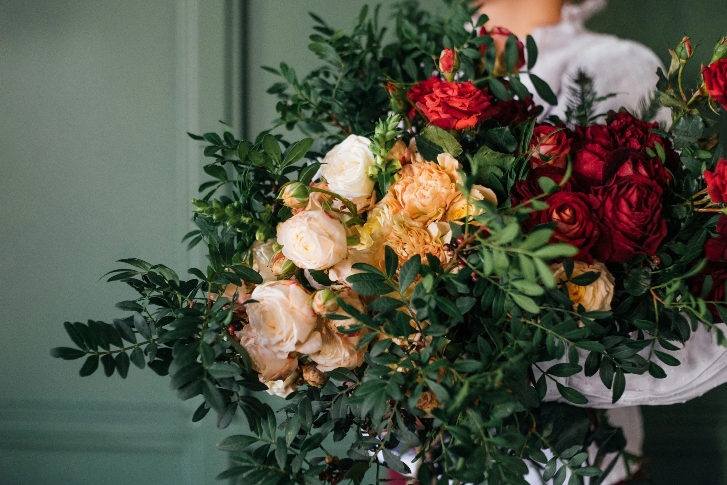
Color palette preferences: Deep olive greens, rich burgundy/plum, warm alabaster cream, and a subtle accent of muted charcoal. Avoid bright, saturated primary colors or overly sweet pastel pinks.
Stage 5. Assets Required
Primary logo: Clean serif or custom lettering
Secondary logo: Monogram or wax-seal style icon for stickers/ribbons
Fonts: Serif header font and a clean, legible sans-serif for body copy
Packaging design concepts: Custom tissue paper pattern, heavyweight craft paper wrapping sleeve design, luxury satin ribbon branding and care instructions card
Digital assets: Social media templates, email signature, and website fav-icon
For a project to be commercially successful the deadline must be hit. Use our project guide to help you stay on-track.
Stage 6. Project Deadline
Initial concepts and mood boards: 4 weeks
Final design approval: 4 weeks
Delivery of assets: 1 week
This timeline is a rough guide based on the projects we have previously completed for clients. We have included it as a guide to illustrate the demands of commercial design but we don’t expect you to religiously follow this.